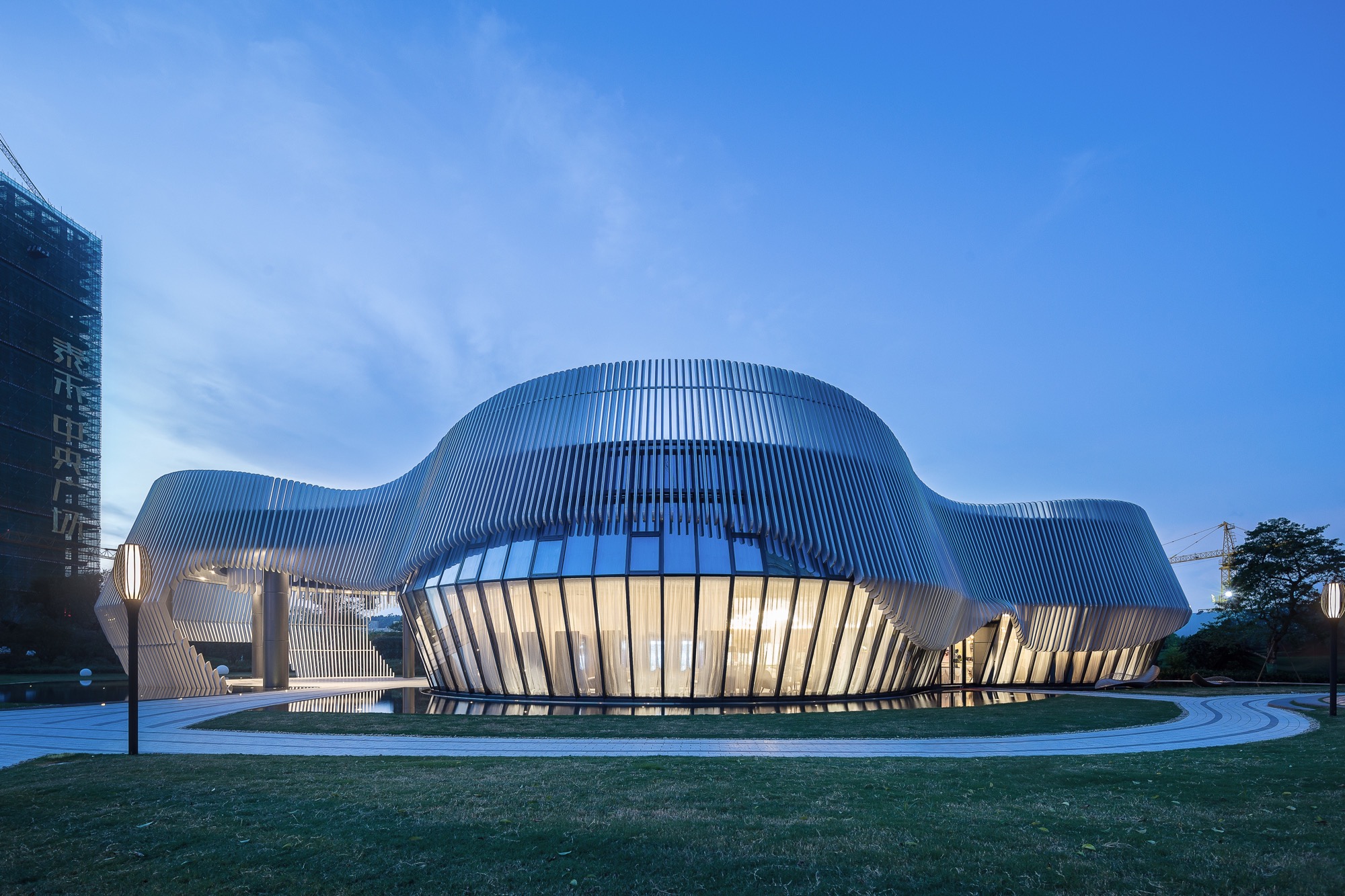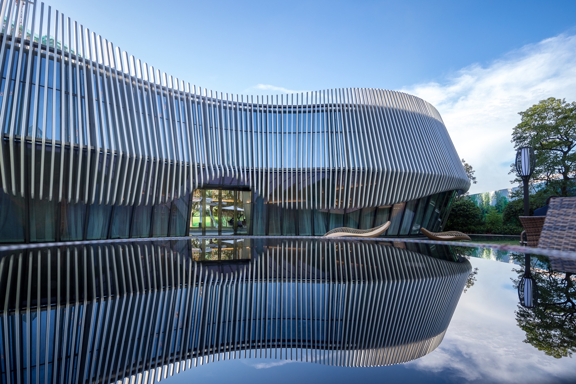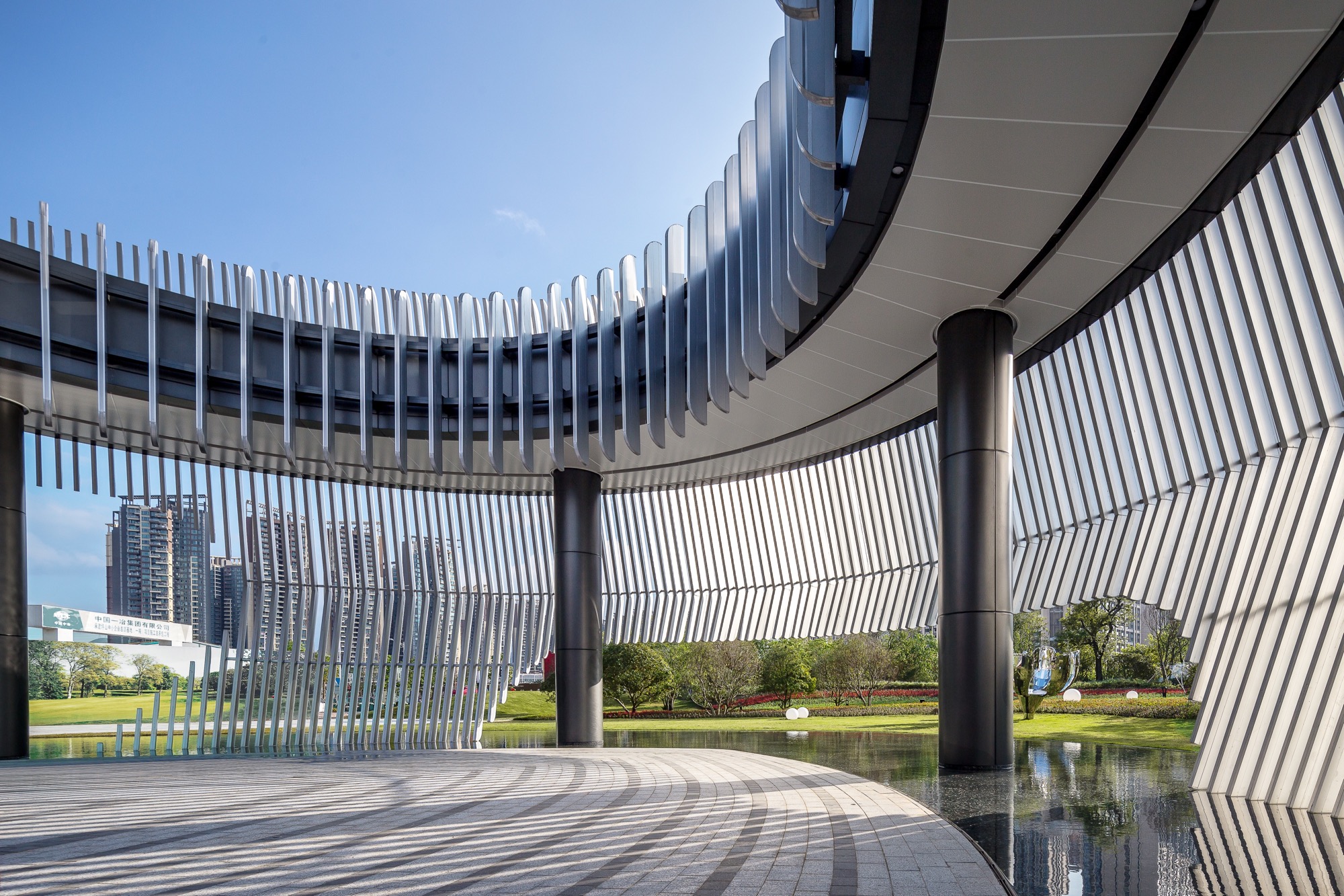
Tahoe Plaza, Shenzhen (Sales Center)
It’s been mentioned again and again of the sustainability of the constructions when it started to design. As the urban architectural sketch with dual attributes of upfront sales and later cultural display, the design is named after ‘Tian Yuan Di Fang’. It inset the circular matrix into the quadrate green park and interact and related the sight line of interior and exterior space with a reserved and introverted posture. The flexible curve form goes sinuously. It defined the three space limits of inner, outer and grey. It also extended the Interface relationship between the buildings and the park, which makes the buildings fit in the whole park’s environment mildly. Take the pedestrian flow as the start point, it generated a plane pattern of four equal circles, the topological relation of space is formed mathematically. At the same time of defining the different spatial attributes, it combined and produced some interesting spatial relationship. It always uses the same language expressions in design inside and outside the building with harmony style and strong integrality.


